Wednesday 19 December 2012

Flatplan


I have created a flatplan to help me layout and plan where the editorial features, adverts and posters within my magazine, what order they are placed in and brief description of each page. It also shows the type of features that appeal to my target audience.


Thursday 6 December 2012

Front cover photos

I have taken photographs of my model/artist, and I will be considering what photograph will be featured on the front cover and the double page spread.
Photo 1:
I like how in this photo the facial expression of my artist gives connotations of her being tough and fierce which is how I planned my main artist to be. I also like the use of the prop and gives a rock and roll feel to the image which would be ideal for a rock/indie-pop magazine. Although if I were to chose this photo for the front cover I would have to ensure that I edit and crop the photo as I think it is too wide for a front cover and this would then
crop out the guitar which is vital in this shot so I will not
be using this picture.  


Photo 2:
This is my favourite photograph that I have taken as it portrays my artist/model as quite relaxed and composed. Although she also looks fierce and strong as well as she is giving direct eye contact to the camera and also has a neutral facial expression which I feel signifies an artist who is dominant and powerful, especially as it is a whole body shot and she dominants the frame. I think this photo sums up all of my planning and all the main features and connotations of my artist best. I will be most likely using this photo for the front cover as it I feel it represents my genre and how I wanted the artist I created to be the most. Also I think it is the sort of photo you'd expect to see on a rock/indie-pop magazine.

                                                                                                                                                                       Photo 3:
This photograph is a whole body shot of my artist where she is holding a guitar and seemingly is about to smash it. This creates a very rock and roll image for the audience which is the sort of mood I want to create for my magazine. It is also the sort of image you'd see on a rock magazine. Her facial expression shows she is entertained which will reflect onto the audience creating a direct mode of address. I like this photo, but I think its best for the double page spread as I think the image fits the persona (fierce/rock and roll) of the artist which would be suitable in a page containing an interview as she is talking about herself.


Photo 4:
I like this close up shot of the artist as it creates a close connection between the artist and the audience and seems more personal than a full body shot. Her neutral facial expression shows that although she is composed and relaxed, but also that she is proud of making it on the front cover of the music magazine. This photo also highlights her make-up more than the other photos. I think I will use this picture for the contents page linking to the double page due to the personal connotations this photo creates which will encourage readers to want to read the interview on the double page spread.


 Photo 5:
I have taken another body shot and use another prop in this photo. I like the use of the amp as the prop because it makes the shot more interesting and unique. It also is iconography of the rock/indie-pop genre. The pose is quite nonchalant and gives the impression the artist is cool and composed, which is the image I wanted to create. The way she has her head leaning onto her hand makes her seem like she is looking at the audience and observing them. I think the artist/model in this photo shows a lot of confidence and also superiority
 which would be ideal for a magazine cover. 


Photo 6:
I like how in this photo she isn't looking at the camera and is quite a natural shot. Like photo 4, it is a close up shot which signifies a close relationship between the artist and the audience/readers. It also is relatively different from the other shots I have taken and the artist isn't giving direct eye contact towards the camera. Therefore I don't think it would be suitable for the front cover as usually looking straight the camera is a convention on music magazine covers.

Photo 7:
I have also taken a mid-shot of my artist. In this photo she is smiling slightly and is quite poised as she has her hands in her pockets showing her composure and confidence. The darkness of the hat, waistcoat and shorts particularly shown in this picture draws attention to the make up. I like this shot and will be using it on the double page spread with the interview as it depicts the artist as someone who is down to earth, but also confident and fierce.


 For the front cover I'll be using photo 2, for the contents photo 4 and for the double page spread, 3 and 7. I will also be using another model/artist for the contents.

Evaluation

I found that taking these photographs was quite easy, although I encountered problems involving the backdrop. Although I used a white blank wall for the backdrop, when I was taking full body shots, the wooden floor was in view. So when editing the photos, I had to edit and use a brush tool to cover any part of the background that wasn't white. I found this to be quite time-consuming, but overall it created the effect of the backdrop being all white.

Photoshoot Plan (front cover)

I am planning to create my photographs for my front cover, and double page spread.

Main cover star:

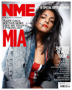
Location: For the main location I will be using a white, blank wall for the backdrop. This will create a more cleaner, fresh look to it as magazines such as Q and NME use plain backgrounds for their front covers. This gives the artist/band a more bold, distinct look making them seem dominant reflecting the ethos of these magazines which defines their strong hold on the music industry. I want to replicate this into my magazine. Using the white background will also allow me to erase it more easily so I can place the image onto any type of background or another colour backdrop.

Clothing/Make-up: I have created a moodboard showing what kind of fashion and make-up I'd like to use on my model/artist for the front cover.


The moodboard includes a few items of clothing that I think that the aritst would wear on a normal day for them, I want to create an image of the artist which portrays them as quite relaxed as they in ordinary clothing (see the NME cover featuring Crystal Castles). Although I do want them to seem quite dominant and powerful as they have made the achievement of featuring of the magazine I am going to create (like how Q is a legendary 'rock and roll' magazine), so I think the choice of red lipstick as part of the make-up gives connotations of power and strength.

The choice of clothing for outfit #1 includes a white shirt, black waistcoat, black bowler hat, and black heels. Outfit #2 consists of jeans, black army boots and a black patterned t-shirt.

The make-up will include smokey/blended eyeshadow, heavy black eyeliner and red lipstick (or lipstick of quite a dark colour) as this is usually what females on the front cover of a similar genre (e.g. Q and NME) wear on magazine covers. For example:

Facial Expression:

I feel the make-up gives them an even more bold, strong look to them and links to the facial expressions I will want to use. Especially as they all are giving eye contact to the camera making it seem they are looking at the audience/reader which signifies their connection with the fans and music lovers of the magazine. For those who haven't heard of the artist who is on the front cover, the eye contact allows the artist to be given a chance as magazines like Q and NME have avid music readers and the artist will want to make an impact on them. I feel that looking straight at the camera allows this and I will ensure my model.artist does the same.

I will also be testing out several facial expressions with different types of moods with the model/artist. Such as sticking out the tongue, a simple smile, or a neutral and serious look.

Camera Angles: 

I will also be testing out different camera angles, mainly I will be using the mid-shot as this the main convention for a camera angle on a music magazine. Although I will be using a variety of angles such as close-up (to portray a close relationship with the reader), a bird's eye view, and low angle to make the artist/model seem dominant and powerful and has a right to be on the front cover of the magazine.

Poses:

Although I will be experimenting several types of poses, I will ensure that model/artist has a strong, confident look to them as all cover stars on magazines show this confidence. I use poses like hand hands on hips, looking to the side, hands behind the head, etc.

Props:

For my props I will be including an amp and electric guitar. This is because they are part of the iconography that my audience would usually associate with a rock/indie-pop magazine. Although I have only seen these types of covers with a male cover star, I am using a female cover star instead.


Wednesday 5 December 2012

Planning

Iconography of Rock/Indie-pop genre magazine


Questionnaire Analysis

My questionnaire contained a mix of both open and closed questions. I chose to create my questionnaire like this as the open questions provide me with more detailed information and gives me specific answers about what they personally think should be within a rock/indie-pop magazine. The close questions allow me to analyse them easier as a whole and get certain answers on questions such as how much they would spend on a magazine.

Question 1:

~Suggestions for what kind of name do you think a Rock/Indie-Pop magazine should have:

My target audience gave various suggestions for what they thought this type of magazine should be named. These are some of the answers I received:

  • A play on words – like Symbol (like cymbal)
  • Keep it short and catchy. And make it the centre of attention on the title page
  • An abbreviation like NME
  • Something named after a song
  • Indie Nation Army
  • Vintage, Indie for the soul, Effortless
  • Indievidual
  • Clash
I think the suggestions and ideas that I was given for a music magazine name are suitable and appropriate for my music genre as suggestions such as 'Indie Nation Army' and 'Indievidual' fit in my chosen music magazine genre. Also it shows my target audience read magazines similar to what I want my own music magazine to be based on as ideas such as  'abbreviation like NME' and 'something that is short and catchy' have been recommended. I will take these suggestions into consideration and will be possibly using one of these names for my own magazine as it is what my audience would like and think it suitable for a rock/indie-pop magazine. It is important I take their opinion into deliberation.

I have chosen the name of my magazine as 'Indie Nation Army', but I am going to combine the suggestions so this is abbreviated to 'INA' so therefore uses more than one of my audience's ideas and feedback because it is an abbreviation like NME and is short and catchy. I think this name is most suitable for my chosen genre.

Question 2:

~What artists/bands would you expect to see in the magazine? (name at least three):


In this pie chart I have created, the results show what people would expect to see in a rock/indie-pop magazine. The most popular artist which was said the most was Florence + The Machine, so when creating my music magazine I will ensure that in some way Florence + The Machine is featured. Such as an interview or album review (shown on the front cover) or an article that shows a new artist this is influenced by this artist which will highlight the artist's popularity and will meet the audience's expectations of seeing Florence + The Machine in this type of magazine. I can also use the artists who were also mentioned multiple times and feature them either on the front cover or the contents page.

Question 3:

~What sort of content/articles would interest you most?

These were the options given for the target audience to tick:
(note that the audience were allowed to tick more than one option)


Other suggestions that were given (this was optional):
  • Only reviews of biopics of musicians and filmed gigs should be included
  • Festival news, soundtracks to film/TV shows
  • Posters
  • Subscriptions to the magazine, letters from readers, maybe something on an aspect of life that people can relate to like the social network 
Gig/concert guides was the most popular option chosen which shows that my target audience goes to these types of events and would like to know in-depth information about them. Also Interviews with artist/bands was a popular choice as it is vital and is a main convention in any type of magazine.
I also gave my target audience an option to give their own preferences of what should be in a rock/indie-pop magazine. It allows me to get a personal response and help me progess in planning my magazine.

Question 4:


~Would free gifts such a CD or posters encourage you to buy the magazine?


All of my target audience had answered Yes which shows that giving away free gifts with a magazine encourages a reader to buy a magazine and that would like a CD or poster relating to the content of the magazine.


Question 5:

~ Out of the following, what colour scheme would be most suitable for this type of magazine?


I offered three similar choices as the main covention for rock/indie-pop magazines (e.g. NME and Q), and I asked my target audience what option they thought would be the most suitable colour scheme for this genre magazine. The most popular choice for a rock/indie-pop magazine was red, black and yellow this may be what colours my audience associates with this annotations due to seeing magazines like NME using this colour palette.


Question 6:

~How often would you buy a magazine of this genre?

The options given were 'Weekly', 'Fornightly' and 'Monthly'


The results show that people mainly buy music magazines monthly, so based on this bar chart I will make my magazine a monthly magazine like Q magazine which is of the same genre of mine.

Question 7:

~How much would you be willing to spend on a music magazine?

My target audience were allowed to write down what the maximum amount of what they'd spend on a music magazine instead of ticking a box with a fixed price of what they would think would be a suitable price. This gives them more flexibility in answering and shows me what individuals thinks is an appropriate price for a magazine to sell for.

Question 8:

~Would you be interested in advertisements of upcoming gigs and concerts?


My target audience were then allowed to write down personal suggestions and ideas for what they thought would be suitable within a rock/indie-pop magazine. I had a variety of suggestions of all which I will take into consideration.

  • Maybe some humorous interviews with bands (like NME has a feature called Does Rock and Roll Kill Brain Cells where they ask rock stars questions about their own band and life)
  • You should include reviews and definitely write about up and coming artists. You should include a festival section- with how to prepare for it and what to take as well as who is playing.
  • Festival reviews and how to get tickets
  • Lots of interviews and gig reviews
  • Free single every issue, with an itunes code to redeem it
  • Maybe style advice to get the style like your favourite artists who are style icons.
    Question time from the public to artists.
    Recommendations on artists that are upcoming and might be worth listening to