Friday, 25 January 2013

Album Cover

Using the online photo editor Pic Monkey, I have created my artist's album cover. I have created this album cover to include on my double page spread (at the end of the article) as if my magazine was to be sold realistically, it would help encourage the readers who hadn't already bought it to buy the album after reading the whole article based on the artist. This helps make my magazine seem more authentic. 


I think the album cover that I have created suits the artist I have created as the colours I have used reflect and coolness and relaxed persona of my artist, but the effect I've used on the face stands out and creates a bold appearance. I also like the font type and the banner behind it, it makes a unique and almost vintage type effect which was what I wanted to create in the first place.




Thursday, 24 January 2013

Mock-up

First Mock-Up


My first idea for a mock-up follows the 'Z' rule in which the reader/audience will read the front of the magazine from the masthead to the sell lines on both sides, to the picture in the bottom right hand corner and then lastly at the price. This is a rule that magazines commonly use to draw in the reader/audience as it makes them look at all the main features and all the interesting articles that the magazine may contain and then usually buying the magazine despite the price. I have used a similar layout for this mock-up which similar to the copy of NME below, as my magazine and NME are of a similar genre, so as well as following the 'Z' I wanted to have my front cover related to how a conventional rock/indie-pop magazine would have theirs.

 
Second Mock-up
 
 
Third mock-up


Contents Page Photos


Second artist pictures

I have taken photos so that I can feature another artist on my contents page. I have based my second artist on Florence and Machine's style through both aspects of music and clothing choice.


In this photo I have chosen to use an acoustic guitar as the props as then the reader would associate it with the genre rock/indie-pop as it is an instrument we would associate with the iconography of this genre. Also the model's facial expression is focused and fairly neutral, showing and signifying that she is determined and focus on her music. The fact she is also not looking directly at the camera also connotes this focus.


This shot shows the artist/model looking upwards almost as if she is aspiring to even more musical success. I like how I have edited it in photoshop to give it a vintage type feel to it, it reflect this artist's type of music. Although you cannot see the whole of her of her outfit and so less of her personality and style comes through to the audience.

I like this photo due to the angle it is taken from. The slight high angle gives it an edginess and almost makes the audience look down on the model/artist. I will feature this on the front page, due to the intriguing effect is creates for the artist.

I also like this photograph as she is using two props, a chair and a guitar. This suggests she is in a place she feels comfortable as she is sitting down and has her guitar - something that this particular artists loves. It also shows the majority of her outfit showing her type of style.

Fonts for the masthead

I am going to chose what font I will be using for the masthead of the front cover. When creating the masthead I will abbreviating Indie Nation Army to INA, make the font INA the bigger and main font (like NME) and then in a smaller font make Indie Nation Army and place it under the abbreviated enlarged masthead. I will be deciding which font is more suitable for the main masthead and which font is better for the text placed beneath it.
I have also chosen to use the colour red for font (and will be edited with a shadow when I will be designing my front cover) and have capitalised the fonts as I feel it immediately catches the reader's attention and exaggerates the boldness of the fonts.

This font is called Nova Solid and is quite bold and simple. I think it would be suitable for a masthead in that it is unique and eye catching as the D, A, O and R letters are filled in to create a block type effect. Although I don't think I will be using it for my final front cover as some of the letters are too close together and will make it hard to read. Also as for the main masthead I will be abbreviating Indie Nation Army to INA, I feel the font is less effective and seems boring. This isn't the kind of mood I would want to create for my magazine.


The second font which I would consider using is called Limit Break. The narrowness of the lines on each letter gives it a clean and slick look to the font. This is the kind of effect I want to create on my magazine as it gives connotations of a polished proficient magazine. Although it isn't extremely bold and striking and  as I would like it to catch the audience's attention, it would probably be better for using inside the magazine.


In contrast to the last font, Newtown Bold uses very thick lines on each individual letter. It is distinct and I feel it will dominant as a masthead on the front page due to the bold and confident look it creates. I like this font as it would be suitable for the abbreviated part of my masthead due to the connotations it gives, but I think the styling of the font is to similar to the masthead of NME and although my magazine and NME and are of a similar genre, I want to magazine to be unique in details such as the masthead.


Kerater is a unique, thin font. It would be suitable for the longer version of the masthead. It is quite sharp and precise, particularly on the letter 'N' as it stands out from the rest. This can connote the types of artists who feature in my magazine, as they are different and unique. I feel that is is the type of font that would be used on the front of a rock/indie-pop magazine as it although it isn't bold, it is striking and will catch the reader's attention. I may use this for the non-abbreviated part of the masthead.


Wednesday, 19 December 2012

Flatplan


I have created a flatplan to help me layout and plan where the editorial features, adverts and posters within my magazine, what order they are placed in and brief description of each page. It also shows the type of features that appeal to my target audience.


Thursday, 6 December 2012

Front cover photos

I have taken photographs of my model/artist, and I will be considering what photograph will be featured on the front cover and the double page spread.
Photo 1:
I like how in this photo the facial expression of my artist gives connotations of her being tough and fierce which is how I planned my main artist to be. I also like the use of the prop and gives a rock and roll feel to the image which would be ideal for a rock/indie-pop magazine. Although if I were to chose this photo for the front cover I would have to ensure that I edit and crop the photo as I think it is too wide for a front cover and this would then
crop out the guitar which is vital in this shot so I will not
be using this picture.  


Photo 2:
This is my favourite photograph that I have taken as it portrays my artist/model as quite relaxed and composed. Although she also looks fierce and strong as well as she is giving direct eye contact to the camera and also has a neutral facial expression which I feel signifies an artist who is dominant and powerful, especially as it is a whole body shot and she dominants the frame. I think this photo sums up all of my planning and all the main features and connotations of my artist best. I will be most likely using this photo for the front cover as it I feel it represents my genre and how I wanted the artist I created to be the most. Also I think it is the sort of photo you'd expect to see on a rock/indie-pop magazine.

                                                                                                                                                                       Photo 3:
This photograph is a whole body shot of my artist where she is holding a guitar and seemingly is about to smash it. This creates a very rock and roll image for the audience which is the sort of mood I want to create for my magazine. It is also the sort of image you'd see on a rock magazine. Her facial expression shows she is entertained which will reflect onto the audience creating a direct mode of address. I like this photo, but I think its best for the double page spread as I think the image fits the persona (fierce/rock and roll) of the artist which would be suitable in a page containing an interview as she is talking about herself.


Photo 4:
I like this close up shot of the artist as it creates a close connection between the artist and the audience and seems more personal than a full body shot. Her neutral facial expression shows that although she is composed and relaxed, but also that she is proud of making it on the front cover of the music magazine. This photo also highlights her make-up more than the other photos. I think I will use this picture for the contents page linking to the double page due to the personal connotations this photo creates which will encourage readers to want to read the interview on the double page spread.


 Photo 5:
I have taken another body shot and use another prop in this photo. I like the use of the amp as the prop because it makes the shot more interesting and unique. It also is iconography of the rock/indie-pop genre. The pose is quite nonchalant and gives the impression the artist is cool and composed, which is the image I wanted to create. The way she has her head leaning onto her hand makes her seem like she is looking at the audience and observing them. I think the artist/model in this photo shows a lot of confidence and also superiority
 which would be ideal for a magazine cover. 


Photo 6:
I like how in this photo she isn't looking at the camera and is quite a natural shot. Like photo 4, it is a close up shot which signifies a close relationship between the artist and the audience/readers. It also is relatively different from the other shots I have taken and the artist isn't giving direct eye contact towards the camera. Therefore I don't think it would be suitable for the front cover as usually looking straight the camera is a convention on music magazine covers.

Photo 7:
I have also taken a mid-shot of my artist. In this photo she is smiling slightly and is quite poised as she has her hands in her pockets showing her composure and confidence. The darkness of the hat, waistcoat and shorts particularly shown in this picture draws attention to the make up. I like this shot and will be using it on the double page spread with the interview as it depicts the artist as someone who is down to earth, but also confident and fierce.


 For the front cover I'll be using photo 2, for the contents photo 4 and for the double page spread, 3 and 7. I will also be using another model/artist for the contents.

Evaluation

I found that taking these photographs was quite easy, although I encountered problems involving the backdrop. Although I used a white blank wall for the backdrop, when I was taking full body shots, the wooden floor was in view. So when editing the photos, I had to edit and use a brush tool to cover any part of the background that wasn't white. I found this to be quite time-consuming, but overall it created the effect of the backdrop being all white.

Photoshoot Plan (front cover)

I am planning to create my photographs for my front cover, and double page spread.

Main cover star:

Location: For the main location I will be using a white, blank wall for the backdrop. This will create a more cleaner, fresh look to it as magazines such as Q and NME use plain backgrounds for their front covers. This gives the artist/band a more bold, distinct look making them seem dominant reflecting the ethos of these magazines which defines their strong hold on the music industry. I want to replicate this into my magazine. Using the white background will also allow me to erase it more easily so I can place the image onto any type of background or another colour backdrop.

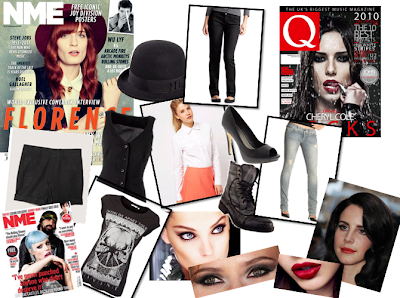
Clothing/Make-up: I have created a moodboard showing what kind of fashion and make-up I'd like to use on my model/artist for the front cover.


The moodboard includes a few items of clothing that I think that the aritst would wear on a normal day for them, I want to create an image of the artist which portrays them as quite relaxed as they in ordinary clothing (see the NME cover featuring Crystal Castles). Although I do want them to seem quite dominant and powerful as they have made the achievement of featuring of the magazine I am going to create (like how Q is a legendary 'rock and roll' magazine), so I think the choice of red lipstick as part of the make-up gives connotations of power and strength.

The choice of clothing for outfit #1 includes a white shirt, black waistcoat, black bowler hat, and black heels. Outfit #2 consists of jeans, black army boots and a black patterned t-shirt.

The make-up will include smokey/blended eyeshadow, heavy black eyeliner and red lipstick (or lipstick of quite a dark colour) as this is usually what females on the front cover of a similar genre (e.g. Q and NME) wear on magazine covers. For example:

Facial Expression:

I feel the make-up gives them an even more bold, strong look to them and links to the facial expressions I will want to use. Especially as they all are giving eye contact to the camera making it seem they are looking at the audience/reader which signifies their connection with the fans and music lovers of the magazine. For those who haven't heard of the artist who is on the front cover, the eye contact allows the artist to be given a chance as magazines like Q and NME have avid music readers and the artist will want to make an impact on them. I feel that looking straight at the camera allows this and I will ensure my model.artist does the same.

I will also be testing out several facial expressions with different types of moods with the model/artist. Such as sticking out the tongue, a simple smile, or a neutral and serious look.

Camera Angles: 

I will also be testing out different camera angles, mainly I will be using the mid-shot as this the main convention for a camera angle on a music magazine. Although I will be using a variety of angles such as close-up (to portray a close relationship with the reader), a bird's eye view, and low angle to make the artist/model seem dominant and powerful and has a right to be on the front cover of the magazine.

Poses:

Although I will be experimenting several types of poses, I will ensure that model/artist has a strong, confident look to them as all cover stars on magazines show this confidence. I use poses like hand hands on hips, looking to the side, hands behind the head, etc.

Props:

For my props I will be including an amp and electric guitar. This is because they are part of the iconography that my audience would usually associate with a rock/indie-pop magazine. Although I have only seen these types of covers with a male cover star, I am using a female cover star instead.